The designer says it feels premium. The founder loves the animation. Someone opens the page on their phone, looks up and asks: “So… what do they sell?”
For a moment, nobody speaks. Then the explanation begins. The product. The audience. The reason for the floating silver object.
There is your problem. The explanation works beautifully when someone is standing beside the screen. Your landing page will usually have to manage alone.
Here is a small way to find that gap before you buy more traffic. Give someone one brief look, cover the page, and listen to the story they can tell back.
First, try it on yourself
The example below is an invented product. Open it for three seconds, then notice what remains. No score, no email, no data collection. You can also keep it visible and read at your own pace.
One brief look at a fictional landing page.
One place for feedback.
Send a cut. Get comments at the exact moment in the video. Keep revisions together.
Fictional example. The walkthrough label is part of the illustration.
- What does this product help someone do?
- Who would find it useful?
- What would the main action open?
Maybe you remember a video tool for freelancers. Maybe only a dark screen and a comment. Maybe you read the button and missed the audience entirely.
That difference is the interesting part. The team knows what every element means. A visitor has to assemble the meaning from whatever they actually notice.
Three seconds is a constraint. The brain has no such deadline.
The internet loves a stopwatch. Fifty milliseconds to impress. Three seconds to explain. Eight seconds before somebody turns into a goldfish.
The research tells a more useful story.
In Lindgaard and colleagues’ 2006 experiments, people rated the visual appeal of webpages after exposures as short as 50 milliseconds. Those ratings were strongly related to ratings at 500 milliseconds. A visual impression can form remarkably quickly.
But “I like the look of this” and “I understand what I am being offered” are different achievements. The study measured visual appeal; it did not show that people understand your pricing, trust your company or decide to buy in a blink.
Tuch and colleagues’ 2012 experiments add another piece: visual complexity and how closely a page resembled familiar website designs influenced aesthetic judgments even at very brief exposures. Lower-complexity, more typical pages were generally rated as more appealing in their experiments.
Our practical reading: make the important signals easy to locate. That does not require every site to look identical. It means the visitor should spend their effort considering your offer rather than deciphering how the introduction works.
A response to the presentation.
A usable explanation of the offer.
A choice shaped by need, evidence and cost.
A study by Kuric and colleagues, published online in 2023, directly examined brief-exposure testing. Participants saw website designs for two, five or ten seconds. Their cognitive abilities and the visual complexity of the designs affected the feedback; more viewing time improved identification of page purpose.
That is a good reason to be careful with the timer. The study did not test a three-second rule. A short exposure can reveal what survives a glance, while longer viewing can uncover whether the explanation becomes clear. Use both. Someone needing more time has not “failed” your website.
For this exercise, three seconds is deliberately strict: a quick way to expose missing signals, not a scientific pass mark.
Two real pages. Two very different things to remember.
The product can be its own explanation
On the version of remove.bg we inspected, a portrait appears alongside an image-upload action and a heading that names background removal. The visual cycles between the subject with and without its background.
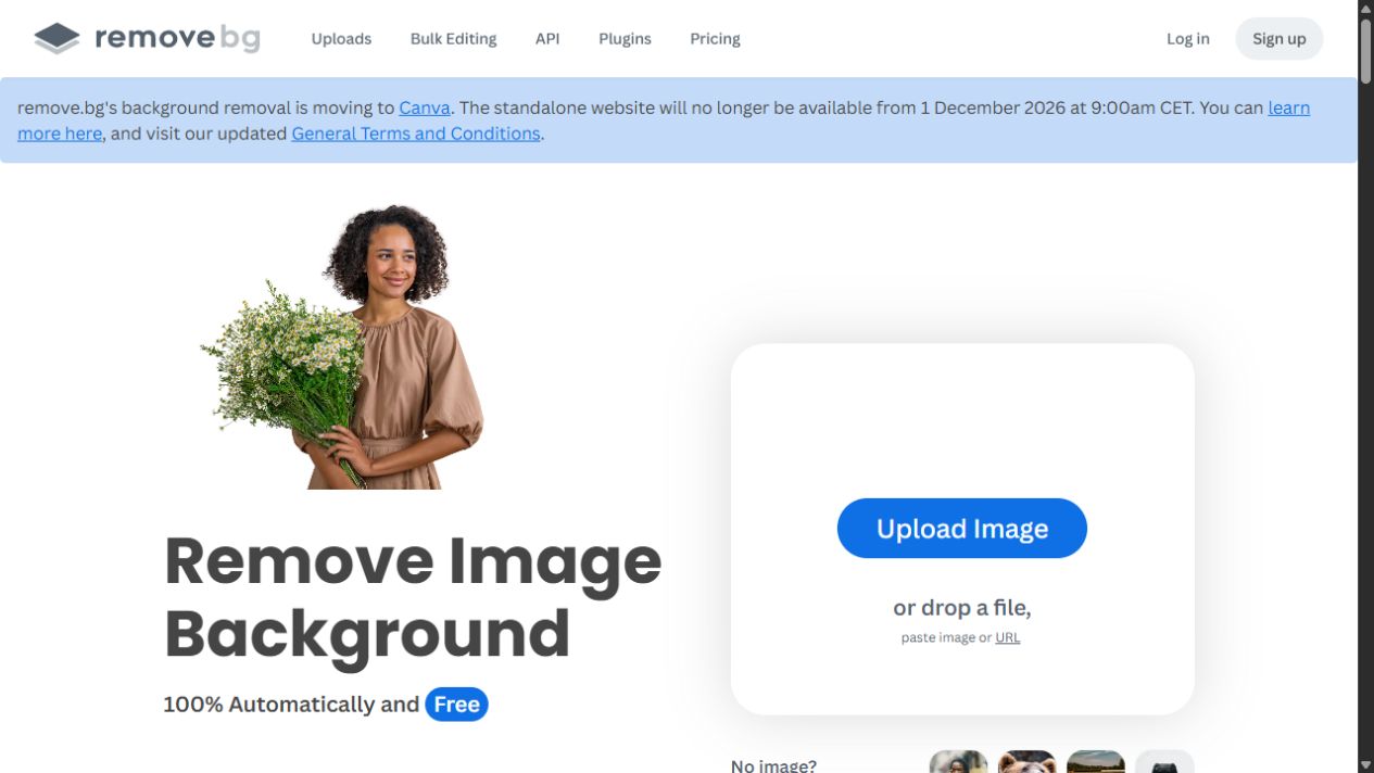
Our reading: the words name the transformation, the image illustrates it, and the action names the input. A visitor has several connected clues from which to build an explanation.
There is a useful lesson here for less visual services, too. A bookkeeping service could show a sample monthly report. A workshop could show what participants make. Choose an artifact that explains something; a decorative object mainly explains your art direction.
A memorable mascot can outshine the job
TinyPNG’s observed opening has a panda, a large upload area and an instruction to drop images. It is easy to spot where to start. The fuller explanation about compression for faster websites appears further down.
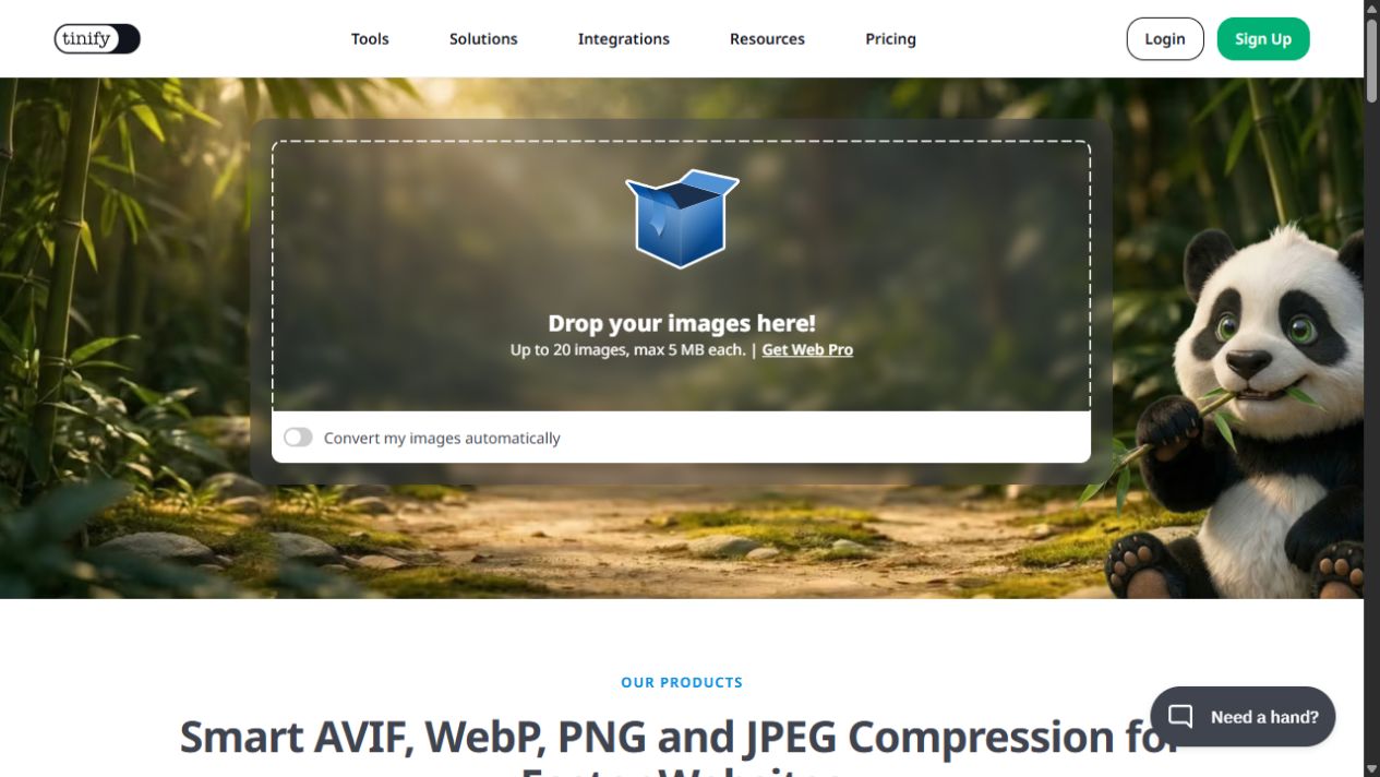
Now imagine two people describing the same screen. “The panda site where I make image files smaller.” “A panda site where I upload pictures.” The first answer includes the result. The second includes the input but leaves the purpose unresolved.
Those are hypothetical responses, not findings from a TinyPNG user test. They illustrate exactly what to listen for. Recognizing a button, or remembering a mascot, is not the same as understanding why to use it. A returning user may already know; a newcomer may need another clue.
Run the test without whispering the answer
Find a few people who plausibly have the need your page addresses, but have not helped build it. A colleague who has heard the pitch twenty times is carrying an invisible instruction manual.
Before showing anything, write down what a reasonable answer would sound like. Accept paraphrases. For Frame, “a way for freelance editors to collect comments on a video” is useful understanding; nobody needs to recite the headline.
Recreate the arrival
If people come from an ad, show the ad first. If you are checking a cold first impression, keep the introduction neutral: “You have followed a link to this page.” Saying “Here is our video-review software” gives away the question.
Show the actual first screen
Use the viewport your audience uses. Start the brief exposure once the screen is ready, then cover it. A screenshot isolates the composition; separately visit the live page to check loading, motion and overlays. A desktop crop cannot tell you what survives on a phone.
Ask what stayed
Begin with “What do you remember?” Then ask what is offered, who it seems useful for, and what they expect the main action to do. Keep “I don’t know” available. Avoid “Did you notice our collaboration feature?”
Give the page back
Let them explore normally. Ask them to find the next step and explain what they expect. If they understood only after scrolling, find the missing clue. If they understood immediately but would not proceed, investigate relevance, trust or commitment.
For the timed exposure itself, let people look rather than ask them to narrate continuously; talking creates another task. Afterwards, record their actual words before explaining the intended meaning.
These small sessions help you locate confusion. They do not produce a reliable conversion forecast or a universal percentage that means “passed.” For people using assistive technology or needing more time, examine comprehension and navigation in their normal mode of use; a timed visual recall exercise cannot stand in for that.
The answer tells you where to edit
Suppose someone says, “An AI platform for teams.” Your page offers bookkeeping for independent restaurants. They remembered the fashionable words and lost the business.
The next edit should make the missing meaning easier to encounter. Adding a brighter button would solve a different problem.
Change the part that caused the misunderstanding, then use fresh participants for the first-glance check. The original participants now know the answer. Keep device, arrival context and exposure conditions comparable when comparing drafts.
Earning another look is the beginning
Liu, White and Dumais’s 2010 analysis of browsing logs describes an initial screening stage before more detailed examination. In their data, the rate of abandonment tended to decrease as a visit continued. That supports taking the opening seriously, while telling us nothing about a universal three-second purchasing deadline.
A clear page can still sell something the visitor does not want. It can explain an expensive service perfectly and leave the buyer needing evidence, a comparison or a conversation. Your first screen does not have to complete that entire decision.
After repairing a misunderstanding, check the real journey: do suitable visitors reach the right next step and complete it? If you run a conversion experiment, define the meaningful outcome in advance and compare equivalent traffic. More clicks on a misleading promise are a worse result, however handsome the chart looks.
Close the page.
What story is still there?
Listen to that story before you explain yours. If the visitor remembers the offer, the relevant situation and a believable next step, the introduction has given the rest of your page something to work with.
Research and observed examples
- Lindgaard, Fernandes, Dudek & Brown (2006). Attention web designers: You have 50 milliseconds to make a good first impression! Behaviour & Information Technology, 25(2), 115–126. Full paper. Visual-appeal judgments, not offer comprehension or conversion.
- Tuch, Presslaber, Stöcklin, Opwis & Bargas-Avila (2012). The role of visual complexity and prototypicality regarding first impression of websites. International Journal of Human-Computer Studies, 70(11), 794–811. The authors’ abstract and research summary describe aesthetic ratings.
- Kuric, Demcak, Krajcovic & Nguyen (online 2023; journal issue 2024). Cognitive abilities and visual complexity impact first impressions in five-second testing. Behaviour & Information Technology, 43(13), 3209–3236. Consulted indexed paper extracts and the authors’ public methods, materials and analysis repository. Exposure conditions were two, five and ten seconds.
- Liu, White & Dumais (2010). Understanding Web Browsing Behaviors through Weibull Analysis of Dwell Time. SIGIR ’10. Observational browsing-log analysis; time on a page is affected by task and is not proof of persuasion.
- remove.bg homepage and TinyPNG homepage. Primary sources for the observed page content and original browser captures.
Checked 18 October 2026. Examples reflect the browser versions observed. Screenshots follow cookie dismissal; live first visits should also be checked with overlays present. The three-second exercise, diagnostic guide and design interpretations are editorial practice, not a validated scientific protocol. No user-study outcomes or conversion improvements are claimed for either real page.