Somewhere around the third round of feedback, the headline loses the product.
Someone wants it to feel more ambitious. Someone else wants more emotion. The founder wants to mention the future. A perfectly useful description becomes “A new chapter in what's possible.”
Everyone in the meeting knows what it means. They have spent six months building the thing.
The visitor has not.
Your hero headline may have been hired to sound impressive when it needs to make the offer recognizable. Before a stranger can want what you sell, they need enough context to understand what is on the table.
The opening is an imagined copy-review meeting. The examples we write below are illustrative; the research sources and two observed product pages are linked.
in what's possible.
Possible for whom? With what?
The visitor can begin judging whether it belongs in their work.
The visitor is trying to place you
A headline on a landing page is encountered during a task. Someone is comparing tools, checking a recommendation or following a link that promised an answer. Their first concern may be wonderfully unromantic: is this the thing I was looking for?
Nielsen Norman Group's 2020 review of its eyetracking research describes scanning as a common way people process online content. Reading varies with motivation, task and the individual. The useful conclusion is to make relevant information easy to find, rather than assume everyone will read your explanation in order.
There is a deeper connection to Pirolli and Card's information-foraging theory. People use available cues to estimate where useful information is likely to be found. A title or description can help someone decide whether pursuing a source is worth the effort.
Applied to a hero, that suggests a practical question: what does this opening let a visitor predict about the rest of the page? This is an application of the theory, not a laboratory result showing that a particular headline converts better.
“Proposal software” gives someone a category to investigate. “What's possible” makes them do more interpretation before they know whether the page concerns proposals, furniture or a leadership retreat.
Give the rest of the hero a job
The answer is not to cram the product, audience, mechanism, proof, pricing and every objection into one enormous sentence.
The opening is a small team. A headline can introduce the offer or its central value. Supporting copy can explain how it works. A useful visual can show the thing. Evidence can support a claim. The button can make the next step predictable.
NN/G's homepage guidance recommends communicating the site's purpose and making the text, imagery and other elements work together. That is guidance for the whole introduction, not a rule that every H1 must contain every fact.
- Headline
Recognize the offer - Proposal software for independent consultants.
- Supporting copy
Understand the workflow - Create a proposal, share one link and keep client feedback beside the latest version.
- Product evidence
Inspect the promise - A readable product preview showing the shared proposal and its feedback.
- Next step
Know what follows - View a sample proposal
This gives the headline room to sound human. You can write something more expressive when the surrounding introduction supplies the missing context. But judge the actual screen a visitor sees, not a headline displayed by itself in a copy document.
On a narrow phone, the supporting explanation may sit much lower. A large type treatment can push an important noun out of view. Wording, layout and imagery need to be reviewed together.
A broad promise can work with a concrete explanation
In the browser version of Calendly's homepage we inspected, the headline reads “All the work around meetings, handled.”
That is a broad promise, but it names a recognizable area of work. The line beneath it makes the scope more concrete by referring to scheduling, meeting recaps and follow-ups. Signup options then present a next step.
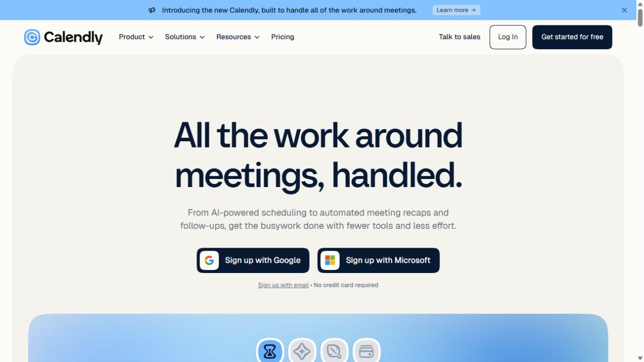
Our reading: the headline and supporting line share the explanation. The headline establishes the territory; the next sentence helps a visitor understand what the promise includes.
That is more useful than a rigid command to make every headline literal. The real question is whether the whole introduction makes sense to someone with the relevant need.
A direct headline can still have a voice
Basecamp's observed homepage takes a more explicit route: “Manage projects, coordinate teams, and master your company with Basecamp.”
The first words name familiar tasks. A product preview beside the copy lets someone inspect what those tasks might look like inside the software. Nearby links provide routes into features, pricing and a tour.
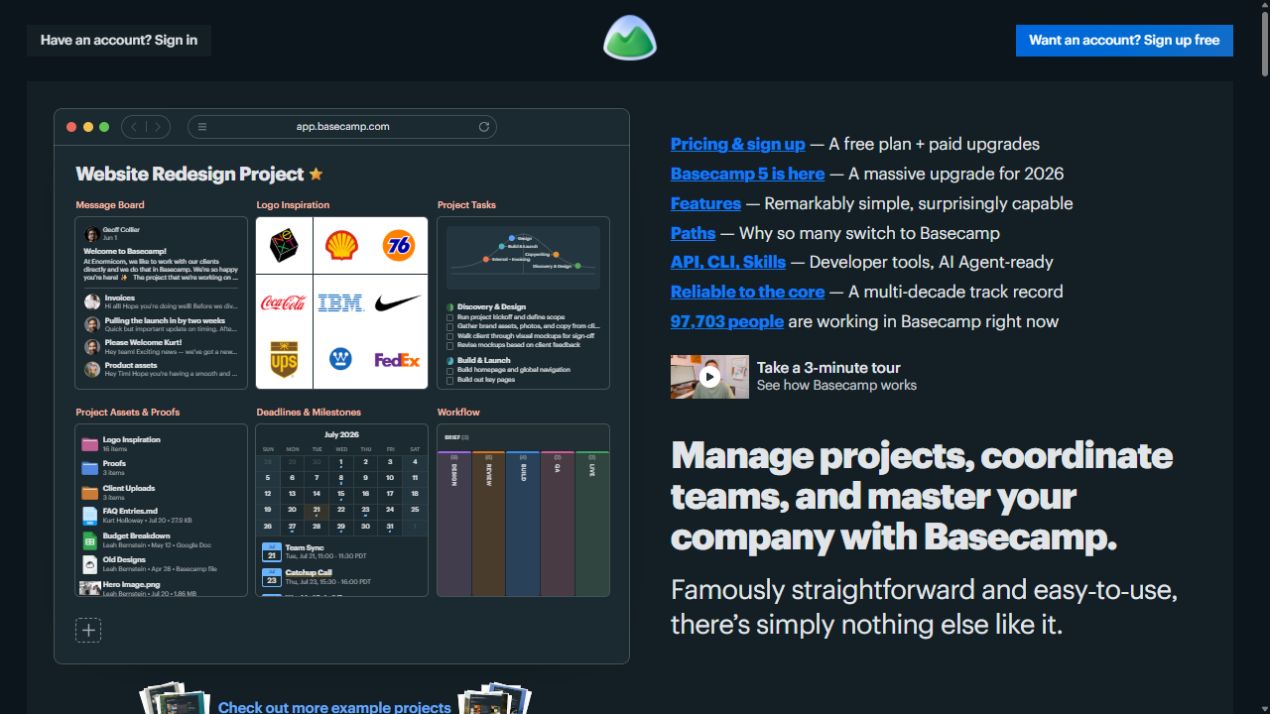
Our reading: a visitor gets an activity they can recognize and an artifact they can examine. The language has personality, but it does not rely entirely on personality to introduce the product.
Neither homepage is a template to copy, and neither observation establishes a winning conversion rate. They demonstrate two ways a hero can distribute information across its parts.
Replace vague praise with something the visitor can picture
When a headline is struggling, the next draft often gains more adjectives. The offer becomes smarter, bolder, frictionless and transformative. Yet the reader still cannot describe it.
Try a different edit. Identify the noun or action the sentence is avoiding.
GOV.UK's content guidance recommends putting important information first and using descriptive headings. It is public-service writing guidance, not a sales-headline experiment, but it offers a useful discipline: make the meaning accessible before expanding on it.
The category becomes visible.
The intended learning outcome becomes visible.
The service and its audience become visible.
These drafts are starting points. They do not yet explain why a buyer should choose one inbox, course or studio over another. A useful next pass can introduce a real distinction: the workflow, teaching format, specialist knowledge or scope of the engagement.
Keep that distinction defensible. Do not turn a wish into a delivery promise. If the product has not demonstrated a specific saving, a neatly phrased number is still an unsupported claim.
Write for the conversation that brought them here
The same words do not arrive in the same situation for every visitor.
A person who has used your product may need to recognize an upgrade. Someone following an ad for a particular service needs to see that service. A stranger comparing categories may need a more explicit explanation than either.
Imagine a link offering a restaurant-opening checklist. The destination opens with a statement about helping businesses thrive, then asks for an email address. The visitor now has to establish whether the promised checklist is actually there.
A heading that identifies the checklist, with a short description of its contents and a matching download action, keeps that conversation intact. This is an illustrative scenario, not a reported campaign result.
Audit the path as a sequence: what the link promised, what the opening confirms, and what the next action delivers. More clicks are not useful if the new wording attracts people expecting something else.
Also distinguish a campaign page from a broad homepage. A homepage may serve several audiences and route them into different parts of a business. It can establish the shared category and make those routes clear. It does not always need to squeeze the whole company into a single narrow offer.
Test what people understood before asking what they liked
“Which headline do you prefer?” can produce an excellent discussion about taste while leaving the basic problem untouched.
Show prospective users the actual hero, with its image and supporting copy. Ask them to describe what is offered, who it seems useful for, and what they expect after clicking. Give them the context of the link that brought them there.
A brief exposure can help reveal what stands out, but there is no magic number of seconds that certifies a headline. Let people explore normally as well. Listen for the difference between recognizing a phrase and understanding an offer.
Find the first misunderstanding
If people cannot identify the product or service, clarify the category. If they understand it but see no relevance, revisit the situation or benefit you lead with.
Fix the whole introduction
The missing explanation may belong in the supporting line or visual. Check the mobile screen before adding another clause to the headline.
Measure a decision that matters
For a controlled comparison, define the outcome in advance and compare equivalent traffic. Track completed signups, purchases or qualified enquiries as appropriate, rather than treating every button click as success.
Small comprehension sessions can expose confusion; they cannot establish a statistically reliable conversion lift. If you run an A/B test, the result applies to the tested versions and audience, not to a universal headline formula.
Write an opening the right visitor can recognize themselves in.
A headline can be elegant, funny or surprising. Let that character help someone grasp the offer. The visitor should leave the first screen with something more useful than the impression that your company has impressive ambitions.
Research and observed examples
- Moran (2020), Nielsen Norman Group. How People Read Online: New and Old Findings. Public synthesis of eyetracking findings, including the influence of task and motivation. The paid report is not treated as material read for this article.
- Pirolli & Card (1999). Information Foraging. Psychological Review, 106(4), 643–675. Read using an author-provided technical-report version. A theory of information seeking, not a landing-page conversion experiment.
- Wang (2024), Nielsen Norman Group. Homepage Design: 5 Fundamental Principles. Guidance on communicating purpose and coordinating the introduction's elements.
- GOV.UK. Create a clear structure for your content. Practical content guidance on important information and descriptive headings.
- Calendly homepage. Primary source for the browser-observed headline, supporting explanation and screenshot.
- Basecamp homepage. Primary source for the browser-observed headline, product preview and screenshot.
Checked 18 October 2026. Product pages may vary by date or visitor; examples reflect the captured browser versions. “Our reading” marks editorial interpretation. Fictional copy is labelled, and no conversion uplift is attributed to the observed headlines.