Picture a founder comparing two studios on a train home.
One tab belongs to a company with offices she has heard of. The other belongs to three people she has never met. The larger firm has a reputation, a substantial portfolio and probably a procurement department. The smaller one has a browser window in which to make its case.
Then she sees a project that resembles her problem. The studio explains what it changed, names the people who did it, and makes the next conversation easy to imagine. She saves the smaller team's page.
That is the opportunity. A small studio can make a particularly strong first impression by making its relevance and judgment unusually easy to see. It still has to deliver after the introduction.
The opening is an illustrative scenario. The research below examines visual judgments, credibility, service value and brand stories. It does not establish that small studios generally outperform large agencies. The two real studios are examples of presentation, not measured head-to-head winners.
The first impression arrives before the credentials
A visitor to your website is not reading the site in the order you wrote it. They encounter an arrangement: a picture, a few words, the weight of the typography, the impression that this might be organized or exhausting.
In Lindgaard and colleagues' 2006 experiments, people could form visual-appeal judgments after seeing homepages for just 50 milliseconds. Their ratings were closely related to those made after longer exposure. The study measured visual appeal, not whether a client trusted an agency or bought a project in a twentieth of a second.
A small team can act on the useful part of that finding. Make the first screen coherent enough to invite a closer look. Use a clear hierarchy. Show a piece of relevant work at a size where someone can understand it. Let the headline introduce an offer rather than compete with the navigation.
There is no need to compress the entire studio into that instant. A glance can open the door; the rest of the page needs to justify walking through it.
- At a glanceDoes this look worth exploring?Hierarchy, legibility, relevant imagery.
- On a closer lookDo they understand my kind of problem?An offer and work I can recognize.
- Before I enquireCan I see why I should trust them?People, evidence and a clear next step.
Give the right visitor something to recognize
A familiar name has an advantage before anyone opens the page. An unfamiliar studio needs to establish a reason to matter.
One practical route is specificity. “We make ambitious brands unforgettable” leaves a founder to work out whether you understand her launch. A clear description of the work, the audience and the engagement gives her more to use.
This does not require choosing a permanent niche. It can mean organizing a broad portfolio around a recognizable situation: a first product launch, a confusing service offering, a business that has outgrown its original identity.
Extraordinary impact.
The visitor still has to discover what is offered.
The visitor can recognize the work and its audience.
The same applies to selecting work. If a restaurant owner arrives and sees three carefully explained hospitality projects, there is less translation to do than if the first screen is an unexplained reel of everything the studio has ever made.
A larger agency can be specific too. The opportunity for a small team is that it can decide which conversation it wants its homepage to begin, then make the whole introduction support it.
Make the people part of the evidence
“Personal service” is easy to write. Showing who takes responsibility gives the phrase something to stand on.
Mothershed Design Co.'s studio page introduces Meg and Josiah Mothershed, identifies the business as a two-person team, and explains their different roles. Meg leads strategy and art direction and is the main contact; Josiah works on design and development. Their portrait makes the introduction literal.
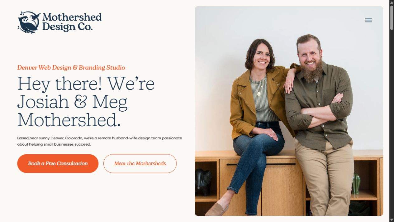
Our reading: the page helps a potential client picture an actual working relationship. A name, a face and a responsibility answer different questions. The photograph introduces the people; the role descriptions explain what they will do.
There is older research behind the broader credibility principle. Stanford's 2002 web-credibility guidelines recommend making the organization, its expertise, real people and contact information visible. These are research-informed guidelines from an earlier web era, not a promise that adding a founder photo will increase enquiries by a particular amount.
For your own site, connect the introduction to delivery. Who reviews the brief? Who designs the work? Who answers when something needs fixing? If collaborators join particular projects, explain that arrangement plainly.
A friendly portrait cannot establish competence on its own. Put the people beside work, responsibilities and an honest account of how the engagement runs.
Show the judgment inside the work
A beautiful project image can attract attention while leaving the buyer with a surprisingly practical question: what did this studio actually do?
A short explanation can make the difference. Name the client's problem, the studio's role and one meaningful decision. If several partners contributed, give them credit. Show the finished work at a readable scale.
For example, a case study might explain that a site's services overlapped, so the team reorganized them around the questions customers asked. It could show the old structure, the new structure and the reasoning. That is an illustrative example, not a claim about one of the studios featured here.
- Situation
- Visitors could not tell which service matched their needs.
- Decision
- Organize the offer around the customer's task.
- Visible evidence
- Show the revised structure and explain your contribution.
- Result
- Report what was measured. Say when no outcome data exists.
Research on services offers a related idea. In Buell and Norton's 2011 experiments, making a service's work visible could increase perceived value. The experiments simulated travel and dating websites; some conditions showed the search activity while people waited. They did not test studio portfolios.
Our application is narrower than a claim of proven portfolio uplift: reveal enough of the real work for someone to understand the value of your decisions. A concise before-and-after explanation can do that without turning the homepage into a production diary.
Avoid using effort as a substitute for an outcome. A hundred sketches might be interesting, but the buyer still needs to know why the chosen direction suits the problem. Process material earns its place when it explains judgment.
When you have reliable outcome data, give the measurement period and context. When you do not, the delivered artifact and a precise account of your role are still useful evidence. Leave the imaginary conversion uplift out.
Let a point of view become visible
A small studio does not have to look like a miniature corporate agency to appear capable. Its work can provide a more compelling introduction.
Studio Feixen describes itself as a small design studio in Lucerne. Its site presents work across disciplines and connects visitors to its type foundry, posters and other projects. The breadth is held together by the work's interest in colour, form and typography.
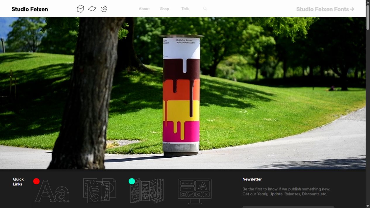
Our reading: the work gives a visitor something distinctive to respond to before a long statement about creativity is necessary. A potential client can begin judging whether that visual sensibility belongs in their project.
That does not mean everyone should copy its presentation. Tuch and colleagues' 2012 research found that visual complexity and how typical a site looked for its category affected aesthetic judgments after very brief exposure. In their experiments, low complexity and high category familiarity were associated with greater appeal.
The practical tension is useful: give the studio a recognizable character while keeping the interface understandable. Distinctive artwork can coexist with readable type, ordinary links, obvious contact information and a sensible mobile layout. Originality does not require making visitors learn a new way to navigate.
Choose a visual idea that grows from your actual practice. A type-focused studio can make typography carry the introduction. An illustration team can show a meaningful sample. A digital product studio can explain an interaction it solved. The evidence and the presentation should feel related.
Being small is a fact. Make its benefit specific.
There is an appealing story available to small firms: people building something with fewer resources and a great deal of determination.
Paharia and colleagues' research on the underdog effect found that such brand biographies could influence preference and choice through identification. The effect depended on circumstances, including people's own identification with underdogs. One real-choice experiment involved chocolate brands, not businesses commissioning a website.
So the safe lesson is not “announce that you are tiny and buyers will prefer you.” For a client, smallness may also raise questions about capacity, continuity or specialist coverage.
Translate the operating model into something they can evaluate. If clients work directly with the people making the work, name those people and describe the relationship. If the team limits concurrent projects, explain how scheduling works. If a specialist is brought in when needed, make that visible.
Only promise what the studio can consistently deliver. Do not invent limited availability to create pressure, or imply that larger firms inevitably delegate badly. A clear account of your own practice is stronger than a caricature of someone else's.
Give the visitor enough detail to imagine being your client.
Respect the advantages a giant actually has
A large agency's reputation, specialist teams, operating history and ability to cover a complex engagement can be exactly what a buyer needs. A polished introduction does not replace those capabilities.
A small studio should be equally direct about fit. Explain the scale of work it can support, what is included, what requires a collaborator and what happens after delivery. A clear boundary may lose an unsuitable enquiry while making a suitable prospect more comfortable.
First impressions also continue beyond the hero. An impressive opening followed by unreadable case studies, broken links or an unexplained form gives someone conflicting evidence. Check the whole route from arrival to enquiry.
Small teams can sometimes keep that route closely aligned because the same people choose the work, write the explanation and answer the enquiry. That is an opportunity to organize around, rather than an automatic property of being small.
Try the introduction on someone outside the studio
Show the opening screen to people who resemble your prospective clients. Give them a brief look, then hide it and ask what they think the studio does and whom it serves. A five-second exposure can be a useful practical exercise; it is not a replication of a 50-millisecond laboratory study.
Then let them explore normally. Ask which project they would examine, who they expect to work with and what they think happens after an enquiry. Listen for uncertainty before explaining the page to them.
If they cannot describe the offer, revise the introduction
Bring the service, audience or project situation into focus. More adjectives rarely resolve an unclear offer.
If they like the look but cannot explain the work, improve the evidence
Show a relevant project, identify your role and explain one decision. Make the images large enough to inspect.
If they are interested but hesitate to enquire, explain the relationship
Name the contact, describe what to send and say what happens next. Check that this matches how the studio actually responds.
These conversations can reveal misunderstandings; a handful of participants cannot establish a conversion-rate advantage. If you compare page versions, define the outcome in advance and consider enquiry quality as well as volume.
The small studio's most persuasive introduction is one it can live up to: relevant work, recognizable people, clear responsibilities and a point of view. That gives the right client a reason to keep the tab open.
Research and real examples
- Lindgaard, Fernandes, Dudek & Brown (2006). Attention web designers: You have 50 milliseconds to make a good first impression! Behaviour & Information Technology, 25(2), 115–126. Visual-appeal judgments, not agency-purchase decisions.
- Tuch, Presslaber, Stöcklin, Opwis & Bargas-Avila (2012). The role of visual complexity and prototypicality regarding first impression of websites. International Journal of Human-Computer Studies, 70(11), 794–811. Researcher's accompanying explanation.
- Fogg (2002). Stanford Guidelines for Web Credibility. A research summary and design guidance, rather than a contemporary conversion benchmark.
- Buell & Norton (2011). The Labor Illusion: How Operational Transparency Increases Perceived Value. Management Science, 57(9), 1564–1579. Author-hosted paper. Its simulated service contexts differ from portfolio browsing.
- Paharia, Keinan, Avery & Schor (2011). The Underdog Effect: The Marketing of Disadvantage and Determination through Brand Biography. Journal of Consumer Research, 37(5), 775–790. Read using an author-uploaded preprint; consumer-brand findings are not a B2B studio comparison.
- Mothershed Design Co., The Studio. Primary source for team size, roles and the observed presentation.
- Studio Feixen: homepage and About. Primary sources for the studio's self-description and observed work presentation.
Sources and example pages checked 18 October 2026. “Our reading” identifies editorial interpretation. Illustrative copy and diagrams are labelled; studio screenshots are attributed beside their use. No small-versus-large conversion uplift is claimed.