The $49 plan hasn't changed. Somehow, it feels less expensive.
A minute ago, you were comparing two subscriptions: $19 for the basics, $49 for the version you actually wanted. You hovered over the second one. Do you really need the expensive plan?
Then a third card appeared. Agency. $149.
Suddenly, $49 looked rather sensible.
No discount. No extra features. Just a new neighbour.
An imagined buying moment. Try the illustration below; the research and real product examples follow.
- 1 person
- 3 active projects
- Basic sharing
- 5 people
- Unlimited projects
- Client approvals
- 25 people
- Unlimited projects
- Multiple workspaces
Studio sits between Solo and Agency. Its price and features are exactly the same.
The camera that became a compromise
In Simonson and Tversky's 1992 camera study, choices split evenly between $169.99 and $239.99 models. Adding a $469.99 model in another group gave the unchanged $239.99 camera 57% of all choices.
It had become the middle option.
- $169.99
- $239.99
- $469.99
The authors examined extremeness aversion: a compromise between attributes can gain appeal. The cameras varied in price and capabilities; the middle model's place in the comparison changed.
That is the intriguing part for a pricing page. The neighbours help a buyer interpret the offer. They do more than occupy the other columns.
The buyer has to live with the decision
Picture someone choosing software for a small studio. They want to stop chasing approvals in email. They also want to avoid explaining why the team is paying for an enormous platform.
The cheapest plan raises one worry: will we outgrow this immediately? The biggest raises another: are we buying somebody else's problems?
A useful middle gives them a sentence they can take back to the team: “This covers our projects and approvals without paying for twenty-five people.”
That reading connects to Simonson's 1989 work on choices based on reasons. His studies found that options gained relative appeal when they became compromises. People sometimes explained their choices through that middle position.
There is a wrinkle: the paper found only partial support for the idea that having to justify a decision strengthens the compromise effect. A compromise was seen as safer, but not necessarily easier to justify. “People always pick the middle to defend themselves” would be a much tidier story than the evidence supports.
For our studio buyer, the practical aim is still clear: make the trade-off understandable. Someone should be able to tell which need each plan serves, and what they give up by choosing it.
A useful middle gives the buyer a reason they can recognize in their own work.
A middle option and a decoy do different jobs
Pricing advice often throws anchoring, compromise and decoys into the same bucket. They describe different relationships.
A high price can supply a reference point for judging another price. A compromise sits between meaningful trade-offs. A decoy is worse than one alternative on the relevant dimensions, while not being similarly dominated by the other. Simonson's paper examines both attraction and compromise.
More money.
More capacity.
- Solo
- $19 · 1 person
- Studio
- $49 · 5 people
- Agency
- $149 · 25 people
Each can make sense for a different team.
More money.
Less capacity.
- Solo
- $19 · 1 person
- Studio
- $49 · 5 people
- Decoy
- $59 · 3 people
With everything else equal, Studio beats the decoy on both dimensions.
For a real product, there is a good reason to build the first kind of range: different customers have different needs. An agency with several teams might actually want the $149 plan.
If the only explanation for your top plan is “it makes the next one look cheap”, revisit the offer. A buyer who needs it should be able to understand its value, too.
Zoom makes the upgrade about the meeting
Consider a consultant running a sixty-minute client workshop. Saving money is welcome. Restarting the call halfway through is less welcome.
In the Zoom Workplace comparison we inspected, Basic lists a 40-minute meeting limit and 100 participants. Pro extends meetings to 30 hours while keeping the 100-participant limit. Business raises capacity to 300 participants.
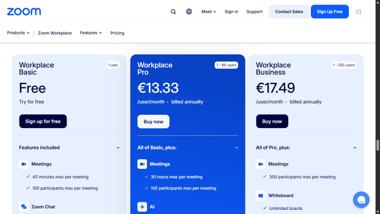
Our reading: Pro gives that consultant a concrete reason to upgrade without needing Business's larger audience. The middle has a job in the customer's day.
The blue treatment makes Pro easy to notice. The meeting limit makes it easy to evaluate. Both matter, but a screenshot cannot tell us how much either contributes to purchases.
Mailchimp puts a reason beneath the badge
On Mailchimp's observed marketing pricing page, Standard sits between Premium and Essentials in the paid comparison and carries a “Best value” label. Free appears separately alongside the paid plans.
Standard offers more extensive automation alongside personalization and optimization tools. Premium adds things such as enterprise SSO and phone and priority support.
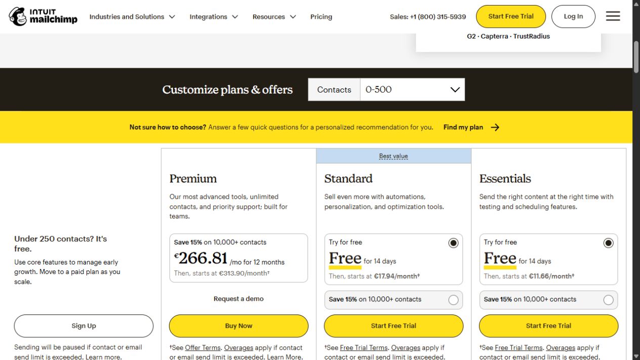
Our reading: a marketer can evaluate a reason to move beyond a short automation without buying the support and administration package above it.
There are four plans overall, with three paid cards here. “Middle” describes a place in a relevant range; the whole business need not have exactly three products.
Neither Zoom nor Mailchimp publishes a controlled result here showing that the middle position caused a conversion lift. These pages let us inspect how the offers are explained.
Build the middle around a moment of growth
Go back to our imagined studio. The useful dividing line is when one person's work becomes a shared workflow. Five people need access. Clients need to approve things. The team has outgrown basic sharing.
That is a better starting point than choosing a price halfway between $19 and $149. The example's $49 is not the arithmetic midpoint. Its role comes from what the buyer needs and how the alternatives compare.
Write the plan descriptions around those situations. Keep the comparison rows consistent. Put the difference that drives the decision near the price, where someone can find it.
Show the billing period, required seats and usage limits clearly. A $49 monthly subscription and “$49 per month, billed annually” are different commitments. The customer needs to know which one they are considering.
A recommendation can help someone find a starting point: “For teams of 2–5” explains who it suits. “Most popular” makes a factual claim about what customers choose. Use it only when your data supports it.
Sometimes your pricing page needs fewer plans
The title comes with a condition: there has to be a real need between the extremes.
If everyone buys the same tightly defined service, one clear offer may be enough. If customers already know their required capacity, an extra package can become a detour. If they cannot afford $49, putting $149 beside it does not change their budget.
Chernev, Böckenholt and Goodman's 2015 meta-analysis examined 99 observations across 7,202 participants. Choice overload depended on factors including comparison complexity, task difficulty, uncertainty about preferences and the decision goal.
That gives us a more useful question than “Is three the magic number?” Ask whether the range helps this customer make this decision. More cards can supply context. They can also supply homework.
Watch what happens after the middle gets picked
Start with a short conversation. Give likely customers a realistic situation, show the pricing, and ask them to choose and explain. Listen for the first moment they cannot tell what they are paying for. These sessions reveal misunderstandings; they do not measure a conversion lift.
For a controlled test, randomly assign eligible visitors to the current page or a version with the proposed range. Keep other changes limited, define the primary outcome and observation window in advance, and count all assigned visitors in the appropriate denominator.
Count completed decisions
Track purchases or paid subscriptions per eligible visitor. The percentage of buyers choosing the middle can rise while fewer visitors buy anything.
Check the economics
Look at revenue and contribution margin per visitor. A new tier might mainly attract customers who would otherwise have bought the more expensive one.
Check the fit later
Follow activation, refunds, downgrades and retention over a suitable period. A plan that looks sensible at checkout should remain useful once the work begins.
Return to that $49 card. The ideal ending is a buyer who can say: “This covers the work we need to do, and I understand what the extra money buys.”
Give the middle a real customer, a clear boundary and a reason to exist. Then it has something more useful to do than stand between two prices.
Research and observed examples
- Simonson & Tversky (1992). Choice in Context: Tradeoff Contrast and Extremeness Aversion. Journal of Marketing Research, 29(3), 281–295. Read in a university-hosted full text; camera comparison on page 290.
- Simonson (1989). Choice Based on Reasons: The Case of Attraction and Compromise Effects. Journal of Consumer Research, 16(2), 158–174. Read in a university-hosted full text. The discussion on pages 171–172 qualifies the evidence about justification and the compromise effect.
- Chernev, Böckenholt & Goodman (2015). Choice overload: A conceptual review and meta-analysis. Journal of Consumer Psychology, 25(2), 333–358. Read using the author-hosted full text. This examines conditions affecting overload, not an optimal number of pricing tiers.
- Zoom Workplace. Primary source for the captured Basic, Pro and Business comparison and meeting limits.
- Mailchimp marketing pricing. Primary source for the captured paid-plan order, Standard label, automation and administration differences, and contact-dependent offers.
Checked 18 October 2026. Product pages vary by region, settings and date. “Our reading” marks editorial interpretation. Original diagrams are labelled; the two product screenshots document observed pages. The research informs the design argument, without establishing a universal conversion benefit.