The product is somewhere behind the form. The form is enormous.
There is a promising headline, a blurred preview and a field for your email address. You arrived to find out whether the thing is useful. The page would like to establish a relationship first.
From inside the company, this can look like a small request. One field. A few seconds. A chance to follow up.
From outside, the unanswered questions are larger. Is this an account, a newsletter or a conversation with sales? Will I see the product next? What have I agreed to hear about?
That is the problem worth fixing: asking for contact before the visitor understands the exchange. An email field can belong on the first screen when that exchange is already clear. It should not have to conceal an offer that cannot yet explain itself.
The opening is an illustrative scenario. The studies and observed product examples below are linked; the example forms and diagrams are our own.
- Arrive
- Give an email address
- Discover what is offered
- Arrive
- Inspect a useful sample
- Choose whether to continue
One field can contain several decisions
Typing an address is only part of the task. Someone may also be deciding whether to create an account, make room for another newsletter, or become reachable by a company they have just encountered.
A vague button makes the uncertainty worse. “Get access” could mean opening a preview, starting a trial or requesting an invitation. The form should tell the visitor which of those is actually happening.
Nielsen Norman Group's research-based guidance on popups describes the frustration caused by email requests before people have interacted with a site. Its recommendation is to provide value and make requests contextually relevant. It also discusses less intrusive alternatives to overlays.
Keep the scope of that evidence straight. An immediate modal interrupts access to the page. A visible, optional form beside an understandable offer is a different experience. Moving the same vague request into the page may reduce interruption while leaving the basic uncertainty unresolved.
Start with the exchange: what will the person receive, why is their address needed, and what happens after they act?
Let someone experience the core idea
Excalidraw's free editor offers a particularly direct introduction. We opened it without signing in, selected drawing tools and made the small diagram below. No email address was needed for that first activity.
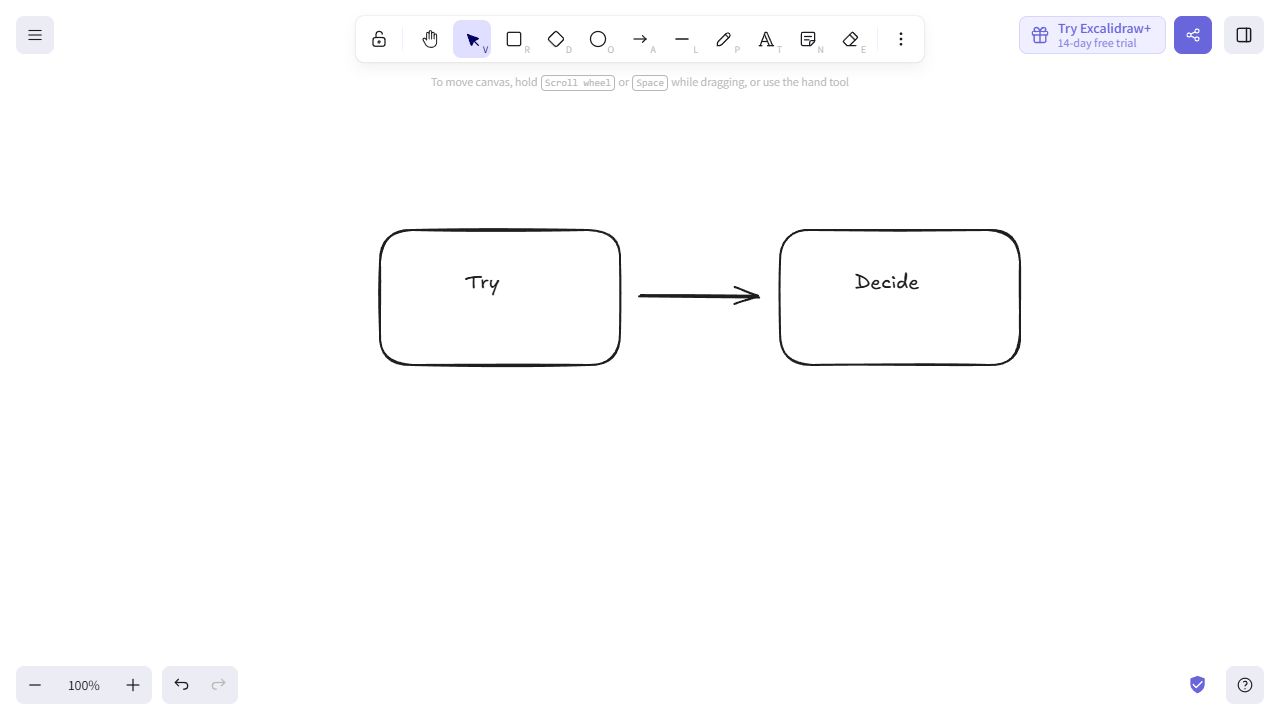
Our reading: an initial drawing lets someone judge the experience directly, before making an account decision.
The distinction between the free editor and the paid service matters. Excalidraw's own product page separates the account-free editor from its Plus offering. Trying a basic drawing without an account does not establish that every feature is available that way.
Your equivalent might be a public sample report, an example project, a usable calculator or a concise demonstration. It does not have to be an unrestricted version of the entire business. Choose something that helps a prospective user judge the actual offer.
If an account is necessary for the service to function, explain that need and show enough beforehand to support the decision. Do not expose private material or promise anonymous access that the product cannot provide.
Sometimes the email is the product
The title of this article needs a useful exception.
Dense Discovery places a subscription form near the top of its homepage. The opening identifies a weekly email, describes its interests across design, technology, culture and art, and presents a visual sample. An archive link gives a visitor another way to evaluate it.
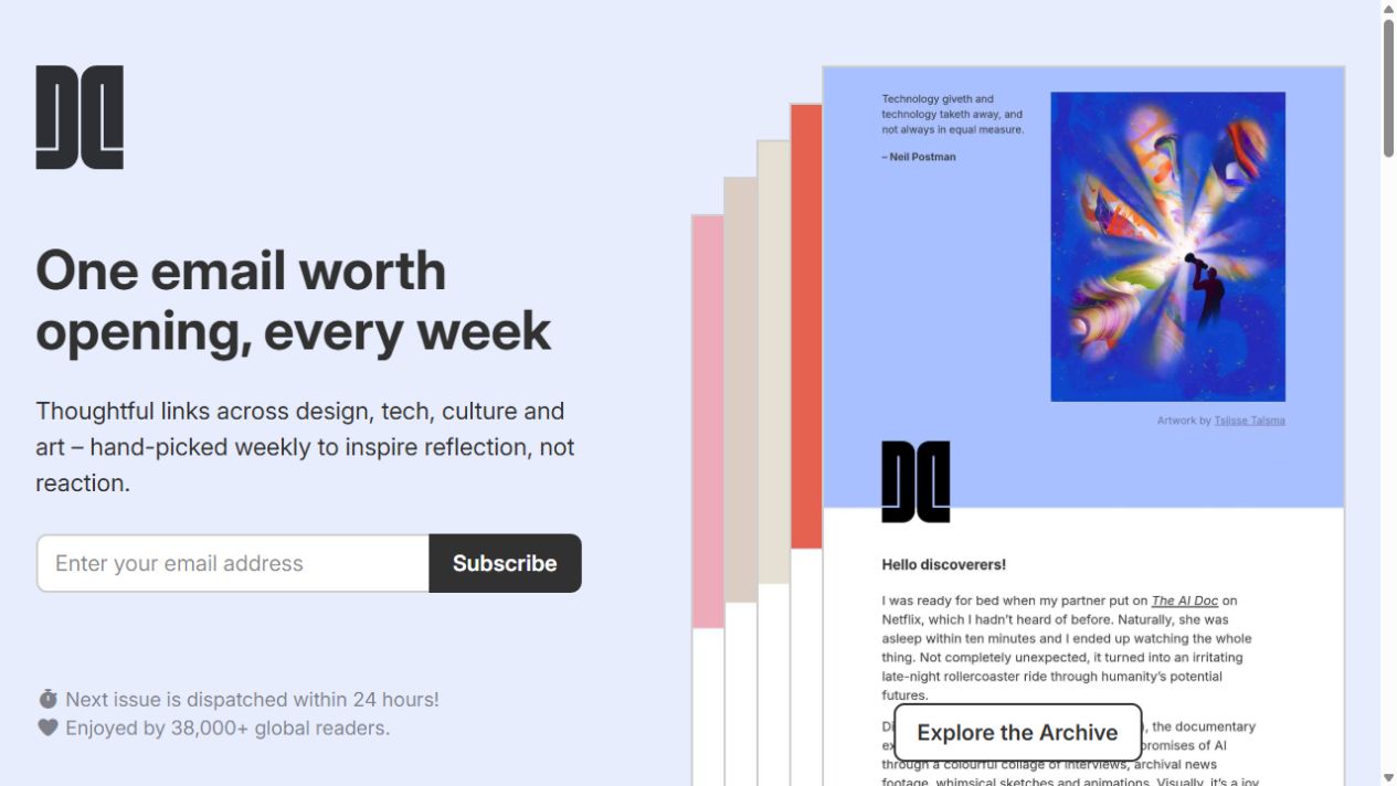
Our reading: subscribing is a direct way to receive the product. Visitors who need evidence can read the archive.
This is a presentation example, not proof that its form position maximizes subscriptions. It shows why banning every first-screen email field would be an unhelpful rule.
The same reasoning can support an explained waitlist, an appointment request or delivery of a document someone explicitly asked to receive. Make the offer's status clear. A waitlist should not look like immediate product access, and a request for contact should not masquerade as an instantly available demo.
Explain the future contact, not just the field
“We only need your email” describes how much typing is required. It leaves the relationship unspecified.
A newsletter invitation can explain its subject and frequency. A demo request can explain whether the next step is a booking or a reply. An emailed resource can explain what will arrive and distinguish that delivery from any separate marketing subscription.
There is relevant experimental evidence. In Mingnan Liu's 2020 study, survey respondents were randomly assigned different email requests. Wording that emphasized only one further survey elicited more addresses. Among respondents who supplied valid addresses, follow-up completion did not differ significantly by request wording.
This was survey research with a non-probability sample, not a newsletter landing-page trial. The practical lesson is to describe the commitment truthfully and track what follows collection.
Emphasizing one further contact elicited more addresses.
Among valid-address providers, completion differences were not significant.
Do not copy the study's limited-contact promise unless it describes your real service. A reassuring sentence becomes a problem when the business behaves differently afterward.
Consider this illustrative newsletter invitation:
A worked example of how a small studio scopes and prices a project.
The invitation gives someone a proposition to evaluate. The same clarity should continue through confirmation, the first message and the way they stop receiving it.
Use a meaningful moment instead of a stopwatch
Replacing an immediate popup with the same popup ten seconds later can leave the visitor in exactly the same situation. They may have spent those seconds reading the headline, dealing with another notice or looking away from the screen.
Think in terms of what has become understandable. Has the person seen an example? Used the core tool? Chosen to receive an answer? Reached the end of material they came to read?
Those are candidate moments to investigate, not automatic triggers that justify an interruption. A permanent inline invitation may be enough. An interested person should be able to find it, and someone pursuing another task should be able to continue.
There is a related lesson in Baymard's research on delayed account creation. Optional account invitations during guest checkout distracted some participants; presenting the option after the order supported the primary purchase task. That finding concerns ecommerce account creation, not the removal of a checkout email needed for order communication.
The broader design question is useful: are you adding a relationship decision while the visitor is trying to finish something else?
Match the request to the visitor's next step
Before removing a form or adding a delay, identify which decision the page actually supports.
They are still evaluating
Make a relevant example, explanation or preview available. Offer a visible route to sign up when they are ready.
They have asked to receive something
Explain what will be delivered and request the information needed to deliver it. Make any additional subscription a distinct choice.
They want a personal or persistent service
Explain why an account is needed, what it enables and what happens next. Make the promised experience understandable before registration.
They are already completing a transaction
Keep the transaction focused. Distinguish necessary contact details from optional accounts, newsletters or sales conversations.
A first-screen form can serve a ready visitor without becoming the price everyone must pay to see the page. Keep that distinction visible in the layout and the wording.
Measure the relationship after the address
The easiest chart to improve is often the number of emails collected. The business may need a different result: active readers, completed setup, suitable enquiries or customers who received what they expected.
For a comparison, define the primary outcome and the denominator before looking at the numbers. For a product, that might be visitors who reach a meaningful activation event. For a newsletter, it could include confirmed subscriptions and later intentional engagement, alongside unsubscribes or complaints.
Report the stages separately. Delaying a request may lose some addresses while helping more people evaluate the offer. It may also fail to help. A sample of enthusiastic users or a screenshot cannot decide that question.
Let new visitors explain the exchange back to you
Ask what they expect to receive, why their address is needed and what contact they anticipate. Conflicting answers are a useful place to start.
Compare a coherent alternative
Try an explained, optional invitation beside useful evidence, or a request at a relevant step. Keep traffic comparable and distinguish new from returning visitors where it matters.
Follow through after submission
Check confirmation, delivery and the next meaningful action. A larger list is valuable only if it supports the relationship your page promised.
Give people a reason to want the next message.
The strongest change may be a better preview, a clearer invitation or a genuinely useful first action. Once the exchange makes sense, an email address can become a natural next step.
Research and observed examples
- Kaley (2019), Nielsen Norman Group. Popups: 10 Problematic Trends and Alternatives. Usability observations and guidance on premature email requests, interruptions and contextual alternatives.
- Liu (2020). Soliciting email addresses to re-contact online survey respondents: Results from web experiments. Methodological Innovations, 13(2). Survey contact requests; these experiments do not test first-screen newsletter placement.
- Scott (2023), Baymard Institute. Save Account Creation for the Confirmation Step. The public research article was consulted; findings concern optional accounts during ecommerce checkout.
- Excalidraw: free editor and product page distinguishing the free and Plus offerings. Drawing without registration was checked directly in the browser.
- Dense Discovery: homepage, archive and public issue inspected. Observed examples of an explained email product and a sample-reading path.
Checked 18 October 2026. “Our reading” marks editorial interpretation. Screenshots document observed versions; form examples and diagrams are labelled. No conversion uplift is attributed to the two products.