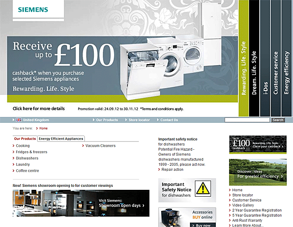
The shopper was looking for a deal on a washing machine. The website had one. In enormous type. Beside a photograph of washing machines.
She left thinking there were no special offers.
This happened in a usability study reported by Nielsen Norman Group in 2013. The Siemens homepage advertised up to £100 cashback. Its large promotional panel rotated automatically, and a smaller promotion sat in the right column. Between the moving panel, its presentation and the unhelpful navigation label, the offer failed to reach the person actively looking for it.
The team had made the offer prominent. The shopper needed to find an answer.
That gap is the interesting part of banner blindness. Your message can occupy a huge amount of screen space and almost no space in the visitor's understanding.
The visitor brought a question
Imagine buying a backpack on Wednesday for a trip on Friday. You are looking for delivery dates. The shop is celebrating its new season.
Those are two different conversations happening on the same screen.
You inspect the product name, price and delivery information. A wide promotional strip may register as something to get past. Even if it contains a useful shipping offer, its appearance can suggest that the answer is elsewhere.
In Benway and Lane's early research, people looking for Internet courses missed a conspicuous course link and followed a small text link instead. Their controlled studies also found that conspicuous, useful links could be missed during specific searches. Crucially, the problem extended to text that did not look like an advertisement. Making something plain was not a guaranteed cure.
One useful way to interpret this: attention is selective about the kind of thing it is looking for. A person searching a menu for a destination may give little consideration to a separate announcement, however helpful its contents.
The design question becomes more precise: does this look like a place where the answer to their question would live?
Useful information can wear the wrong uniform
Visitors do not have your organizational chart. They cannot tell which rectangle came from marketing, which came from support and which contains the detail that would save them a phone call.
They have the rectangle.
NN/G's 2018 eyetracking findings describe people avoiding ad-like content, conventional ad locations and content near ads. In one recorded Generac session, someone shopping for a portable generator scrolled past installation information. Its contrasting appearance made it resemble an advertisement.
That is an expensive misunderstanding. The information belonged to the purchase, but its visual treatment suggested an interruption.
Learned expectations offer part of the explanation: if a region repeatedly contains irrelevant promotions, avoiding it can be an efficient shortcut. But the course-link research gives us a reason to keep the explanation broader. Separation from the user's search path matters too.
Before adding another border, colour or animation, inspect what your styling tells someone about the content's role. “Important to us” and “useful to you right here” can look very different.
What they read instead: clues to the next decision
Back to the backpack. “Can this arrive before I leave?” makes a tiny delivery sentence more valuable than an enormous seasonal campaign.
NN/G's synthesis of online-reading research describes scanning as common, with reading depth varying by task, motivation, focus and individual. People can read carefully when the material matters to them. The opportunity is to help them find that material.
A particularly useful pattern is scanning descriptive headings, then reading selected text beneath them. A heading such as “Delivery and returns” gives the backpack shopper a promising place to look. “Made for your next adventure” leaves them guessing.
The same principle changes with the task. A buyer comparing subscriptions may examine limits and billing terms. Someone choosing a course may look for prerequisites and sample lessons. A reader troubleshooting an error may skip a beautiful introduction and go straight to the matching error message.
These are examples of what a task makes relevant, rather than a universal ranking of page elements. There is no rule that small text always beats large text. The useful clue is the one that lets this visitor make progress.
- Capacity
- 24 litres
- Delivery
- Arrives by FridayOrder before 2pm Wednesday.
For the selected delivery address.
For a real shop, that promise needs real stock, a destination and a valid cutoff. A useful placement cannot rescue an inaccurate delivery estimate.
The practical move is to put essential information where people need it to decide. A promotion can introduce an offer; a product page should still explain the applicable terms. Nobody should have to remember a banner from three screens ago to understand what they are buying.
Ignored can still mean distracting
The tempting response is to make the banner move. If it interrupts the eyes, surely the message gets through.
Burke and colleagues' 2004 experiment makes that assumption uncomfortable. Twenty-four adults searched lists of news headlines with static, animated or blank banners. In the simpler task, where people matched an exact headline, both commercial banner types slowed search compared with blank banners. The harder, meaning-based task showed no significant difference between banner types.
Memory for the advertisements was poor, and recognition was worse for animated banners than static ones after accounting for guessing.
So a banner could impose a cost without leaving much of a message behind. This was a controlled search-and-memory experiment, not a sales test. Its lesson is to question what you bought with the interruption.
There are several steps between occupying a viewport and helping someone decide. A glance, a correctly understood offer and a completed purchase are different outcomes. Measure the one you actually need.
- On screenThe element was displayed.
- Looked atSomeone directed their gaze toward it.
- UnderstoodThey can explain what the offer means.
- UsedIt helped them take a relevant action.
Even a face can steal the wrong attention
There is a more subtle version of the same problem: the banner works beautifully at getting someone to look at the model.
The product beside the model gets less of the benefit.
In a 2014 study by Sajjacholapunt and Ball, 72 university students browsed information pages containing banners with no face, a face looking toward the viewer, or a face looking toward the advertised content. Direct gaze concentrated attention more on the face; averted gaze increased attention to the advertising text and product, and improved memory for the advertising information.
This was an eye-tracking and memory study using constructed pages, not evidence of a guaranteed purchase lift. It illustrates a useful distinction: catching attention and directing it are separate design jobs.
The broader question applies to any illustration or animation: after someone notices it, where have you helped them look next? A beautiful element can earn its place by explaining the offer. It can also become a very successful distraction.
Fix the route before turning up the volume
Start with one message people keep missing. Write down the task during which they need it. “Customers need to notice our campaign” is your objective. “I need to know whether this arrives before Friday” gives you a location, a moment and words to use.
Find the decision it belongs beside
Put delivery information near delivery choices, plan limits beside plan comparisons, and prerequisites near course enrolment. Keep a useful banner if it serves a purpose; give essential information a home in the task itself.
Make the meaning survive a quick scan
Use a descriptive label and a concrete answer. Check the phone layout: a message beside a button on desktop may end up far from it on mobile. Use visual emphasis to clarify the relationship.
Test with a reason to visit
Give prospective users a realistic task without mentioning the banner. Observe whether they find and use the information. Ask what they understood before pointing it out. Asking “Did you see our banner?” gives away the thing you needed to discover.
Small usability sessions can reveal a failure; they do not establish a conversion uplift. For a controlled comparison, define the relevant outcome in advance and compare equivalent traffic. Track task completion or completed purchases alongside banner clicks, with misunderstanding and abandonment as useful checks.
If banner clicks go down because people can now find the answer without clicking it, the design may be doing a better job. Choose the measure that reflects the person's progress.
The Siemens shopper had a reason to care. The page had something worth telling her. The connection failed.
Give your useful message a place in the visitor's question. Then it has a chance to become part of the answer.
Research and real examples
- Benway, J. P. & Lane, D. M. (1998). Banner Blindness: Web Searchers Often Miss “Obvious” Links. Author-hosted paper; usability observations and controlled search experiments, including useful non-advertising links.
- Burke, M., Gorman, N., Nilsen, E. & Hornof, A. (2004). Banner Ads Hinder Visual Search and Are Forgotten. CHI extended abstract; 24 participants, search time and recognition memory. Eye-movement results were not reported in this paper.
- Sajjacholapunt, P. & Ball, L. J. (2014). The influence of banner advertisements on attention and memory: human faces with averted gaze can enhance advertising effectiveness. Frontiers in Psychology, 5, 166. Attention and memory, rather than observed purchases.
- Pernice, K. (2018), Nielsen Norman Group. Banner Blindness Revisited. Eyetracking observations, including the Generac installation-information example.
- Nielsen, J. (2013), Nielsen Norman Group. Auto-Forwarding Carousels and Accordions Annoy Users and Reduce Visibility. The historical Siemens task and source image. A usability case with several interacting problems.
- Pernice, K. (2019), Nielsen Norman Group. The Layer-Cake Pattern of Scanning Content on the Web. Descriptive headings and selective reading.
- Moran, K. (2020), Nielsen Norman Group. How People Read Online: New and Old Findings. Public synthesis of reading research; the paid report was not accessed.
Sources checked 18 October 2026. The backpack shop and redesigned course menu are fictional illustrations. The Siemens and Generac cases are historical research observations. Practical recommendations are editorial interpretation, not a universal performance formula.