Send a conventional landing-page checklist to these six businesses and someone will have an awkward meeting.
One took money for nothing. One sold a wall of advertisements. One offered simple cat drawings. A software company put an enormous customer photograph where much of the sales pitch used to be.
People paid, pledged or signed up. The interesting question is what made the strange choice useful to the person deciding.
These are historical campaign and acquisition pages, including homepages built around a particular action. The dates matter. A current homepage is not evidence for a result achieved by an earlier version.
What “convert” means here
A conversion is a defined action. Below, that can mean a payment, a pledge, a paid signup or a waitlist registration. Only the Highrise example reports a comparative signup lift. Sales totals and waitlist growth establish activity; they do not tell us the percentage of visitors who converted or prove that an unusual design caused the result.
01 · Black Friday, 2015
Cards Against Humanity: the offer was nothing
The familiar advice: lead with a useful benefit.
On Black Friday, shoppers expect a discount. Cards Against Humanity removed its regular store and gave visitors a way to hand over $5 for nothing.
It sounds like a conversion consultant's nightmare. There is no useful object to photograph, no feature comparison to win, and no saving to calculate.
Yet contemporaneous reporting, citing the company, put the money received at $71,145.
A strange offer.
An understandable exchange.
Our reading: the practical product had disappeared, but participation was still available. To an audience that enjoyed the brand's humour, the payment could be a way of joining the joke. The absurdity was the attraction; understanding the next step was easy.
That distinction matters. An unexpected offer can be compelling while its terms remain completely understandable. Mystery about what happens to someone's money is a different experience.
Borrow this: give the unusual idea a clear transaction. A funny launch, limited edition or fan event can have an unconventional reason to participate and an ordinary, well-explained next step.
The limit: an established comedy brand's fans are a different audience from strangers comparing unfamiliar suppliers. The reported receipts are not a page conversion rate or an A/B result.
02 · Launched 2005, sold out 2006
The Million Dollar Homepage: the clutter was the product
The familiar advice: remove competing links and visual noise.
Alex Tew's page offered a million pixels of advertising space at a dollar per pixel. The result resembles a browser that swallowed a shopping district.
But for an advertiser, the crowded image was also the inventory. The page showed what was being sold and who was already there. A clean hero illustration would have hidden much of the proposition.
The Register reported in January 2006 that the grid had sold out and generated over a million dollars. Its final 1,000 pixels went through an auction.
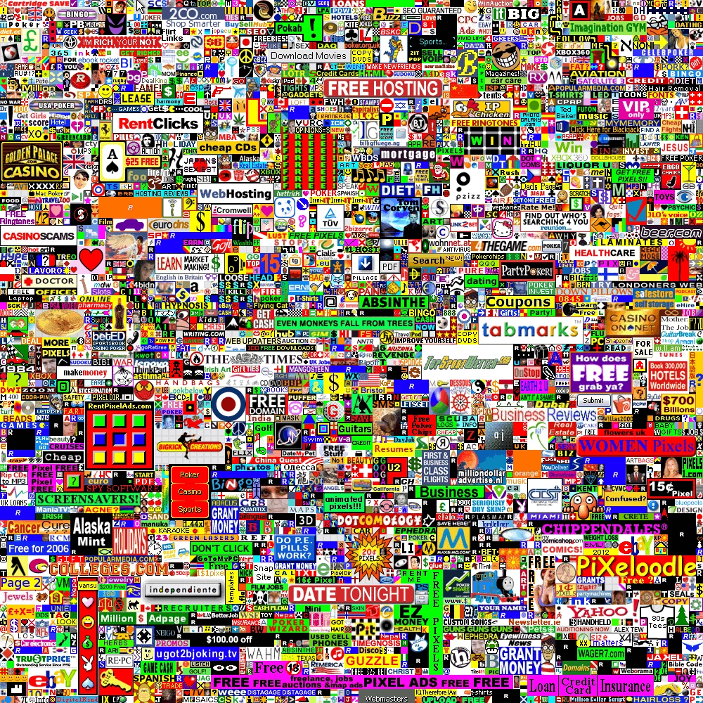
Our reading: buyers could purchase a visible place in a shared spectacle. The finite grid made the offer tangible. The design's density had a job that an ordinary lead-generation page does not have.
There is also an important audience split. Someone browsing the ads was doing a different task from someone buying space. Counting clicks on the finished wall would not measure how effectively the site sold advertising.
Borrow this: when visibility among other participants is part of the product, show the actual shared space. A directory, sponsor wall or exhibition can benefit from displaying its occupants rather than disguising them as decoration.
The limit: this was a distinctive commercial event with substantial attention around it. Its success does not show that clutter improves an unrelated pricing page, or that its tiny links and fixed-size presentation are a model for mobile accessibility.
03 · Historical business result; current owner imagery
I Want To Draw a Cat For You!: the handmade part was the point
The familiar advice: make every visual look professionally polished.
Steve Gadlin offered to draw the cat someone described. The idea is disarmingly specific: a person, a request and a drawing.
ABC's Shark Tank episode notes, published in 2013, described a $9.95 service that had already brought in $10,000. That is a historical business claim, not a measurement of today's page.

Our reading: this is a gift and a personal interaction as much as an art purchase. The visible human behind it and the simple drawing style help explain what the buyer will receive. Polishing the work into an anonymous stock illustration could change the appeal of the offer itself.
The specificity does a lot of work. Compare “a delightful creative experience” with a request someone can actually picture: a cat driving a tiny bus. The second gives the visitor something to imagine giving to a friend.
Borrow this: preserve evidence of the person and process when those are part of the value. Show genuine samples and say clearly what can be commissioned.
The limit: ABC's figure is a reported business outcome, with no visitor denominator or design comparison. It does not establish the role of a particular layout, and later television exposure is another reason not to treat this as a universal acquisition formula.
04 · A/B tests published 2011
Highrise: an enormous customer replaced much of the pitch
The familiar advice: explain more of the product to make the case stronger.
Highrise's team tested a page built around a large photograph of a real customer, a testimonial and a compact pitch. There was much less product information than in its long-form design.
The team's published account reported 47% more paid signups than the long-form version. That is a relative increase against a named comparison, not a 47-percentage-point gain.
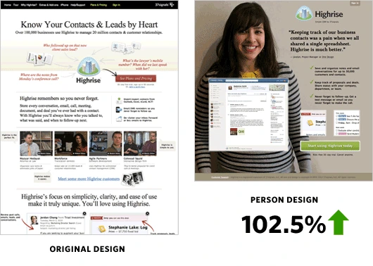
Our reading: the customer made an abstract software purchase easier to picture in a small business. Instead of working through a large collection of arguments, a visitor could quickly encounter a recognizable person using the product.
That interpretation is not what the experiment isolated. The team changed several elements together. A better-performing page package does not establish that a smiling face, a specific colour or less text caused the improvement on its own.
Borrow this: test a substantially different way to make the product understandable. Put credible customer experience near the main decision when that experience resolves a real uncertainty.
The limit: this is a company-reported test, not a general rule that shorter pages win. The original post explicitly cautions readers against copying its result without testing.
05 · Early acquisition, 2007–2008
Dropbox: a demonstration and a very plain email form
The familiar advice: launch with a fully developed marketing site.
The early Dropbox acquisition story looks almost unfinished next to a modern software launch. A screencast demonstrated the idea; a minimal page collected email addresses.
In Drew Houston's Startup Lessons Learned presentation, the March 2008 beta video is associated with the waiting list growing from 5,000 to 75,000 in one day. The deck also shows the sparse email-capture page.
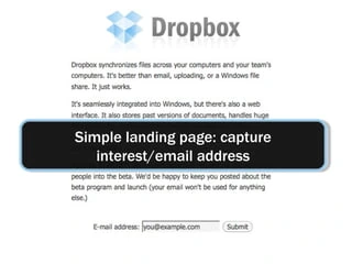
Our reading: a working demonstration can carry explanatory weight that a polished feature list cannot. For a product whose value appears when files move between machines, watching the outcome makes the promise easier to understand.
The plain destination then asks for a proportionate commitment: express interest in access. It does not need to answer every question someone might ask before a large annual purchase.
Borrow this: when the product is easier to understand in motion, build a concise, truthful demonstration and give interested people an appropriately small next step. Make a waitlist's status explicit.
The limit: this was waitlist growth around a video and its distribution, not 70,000 paying customers or a measured conversion-rate lift caused by the page. It is also not evidence that Dropbox had no working technology at the time.
06 · Kickstarter campaign, 2015
Exploding Kittens: the pitch already felt like the game
The familiar advice: sound serious before asking for money.
The campaign introduced a card game through kittens, explosions and an unmistakably comic sensibility. The pitch let prospective backers encounter the personality of the thing they were being asked to fund.
The campaign's public record shows 219,382 backers pledging $8,782,571. Those are crowdfunding commitments, not a landing-page conversion percentage or the project's profit.
Our reading: the humour functions as a sample. If that particular kind of nonsense appeals to someone, the page has already given them a small encounter with the product's entertainment value.
That is a different job from making a joke to decorate an unrelated service. For a game, enjoyment of the pitch can help someone judge whether they want the experience. For a payroll tool, a joke does not demonstrate that salaries will arrive correctly.
Borrow this: let the page demonstrate the experience people are buying. An entertainment product can entertain. A teaching product can teach something. A design tool can make a useful interaction available to try.
The limit: the creators, their existing reputations, publicity and Kickstarter's platform all belong to the story. The pledge total cannot isolate the effect of the illustrations or tone, and a pledge is not the same thing as a fulfilled retail order.
What the numbers actually say
These examples belong together as design lessons, but their results do not belong on one performance leaderboard.
| Example | Reported result | What it measures |
|---|---|---|
| Cards Against Humanity | $71,145 received | Campaign receipts; no visitor conversion rate |
| Million Dollar Homepage | Grid sold out; $1m+ generated | Commercial outcome; no controlled design comparison |
| Cat drawings | $10,000 in ABC's episode notes | Historical business claim; no page-level denominator |
| Highrise | +47% paid signups vs long-form page | Company-reported comparative test; relative lift |
| Dropbox | 5,000 → 75,000 on the waiting list | Acquisition around a beta video; not paid adoption |
| Exploding Kittens | 219,382 backers | Recorded crowdfunding participation; not a conversion rate |
The useful rule they kept
The surfaces are wildly different. The decisions are surprisingly concrete: participate in a joke, buy a patch of visibility, commission a drawing, try a tool, request access or back a game.
Each strange choice needs to earn its place by helping someone understand or experience the offer. If it merely adds a puzzle between interest and action, the case for it becomes much weaker.
Keep the unusual part of the promise. Make the next step easy to understand.
There is a selection problem here, too. A list of memorable successes does not include all the strange pages that went nowhere. Existing audiences, press attention, timing, product appeal and price can do work that a screenshot makes invisible.
Try one useful rule break on your own page
Name the uncertainty it will resolve
A customer-led page might make the audience recognizable. A short demonstration might explain the outcome. Choose the visitor's problem before choosing the visual surprise.
Keep the offer and its terms understandable
Visitors should know what happens when they act, what it costs and what they receive. Preserve readable text, keyboard access and a usable mobile path.
Test the complete decision
Compare the current page with a coherent alternative, using comparable traffic and a conversion defined in advance. Distinguish a CTA click from a completed signup, qualified enquiry or purchase. Track later cancellations or lead quality when they matter.
You may learn that an unconventional design suits your audience. You may also learn that the familiar version works better. Either result is more useful than copying a famous page whose audience, offer and traffic you do not share.
Sources and original material
- GamesBeat, 30 November 2015. Contemporary report on Cards Against Humanity's $5 campaign, citing the company's result. The old company recap could not be retrieved during this research.
- The Million Dollar Homepage, including its served advertising grid. Tim Richardson, The Register, 12 January 2006: Contemporary report on the grid selling out.
- Steve Gadlin's business website, including the portrait. ABC, episode notes published 25 July 2013: Season 3, Episode 7.
- Jamie, 37signals / Signal v. Noise, 23 August 2011. Behind the scenes: A/B testing part 3, including the original comparison graphic and explicit warnings about generalizing.
- Drew Houston, Startup Lessons Learned, a reproduction of the founder's 2010 presentation. Slides 12–13 document the acquisition approach and waiting-list result. The host's automated summary is not used as evidence.
- Exploding Kittens: original Kickstarter project record, including the published pledge and backer totals.
Sources checked 18 October 2026. “Our reading” marks design interpretation, not an experimentally established explanation. Source images are credited beside their use; editorial diagrams are labelled. Historical results should not be read as present-day performance.